Inkscape - An Improved Look & Feel
February 18, 2021 March 26, 2021
I recently had to modify a beer label design. I started from a default install of Inkscape on a new machine. I opened the application and I was like, “omg… I forgot how horrible this interface feels.” Here’s some quick notes on some simple changes that will make Inkscape look and feel a bit more like a grown-up app.
First, in case you don’t already know, Inkscape is surprisingly capable cross platform, open-source vector graphics editor and design program. In effect, it’s a free version of Adobe Illustrator. Inkscape has been in development since 2003 and was released as a version 1 product in May of 2020.
It is not perfect. It can be frustrating to use. But regardless of the many small annoyances you may run across, it’s robust, it’s fast, it has a huge amount of functional depth, and in the right hands, is capable of really great results. Inkscape’s biggest failure is it’s LACK OF CMYK SUPPORT.
So, back to the interface… I know it’s pretty standard for everything in Windows to treat us like children; always asking twice before allowing any change; large, bright, candy-like buttons all over the interface; design that hides control function and continually drives me toward what it thinks I want, etc., but I want lots of information, and I want it packed into my screen real-estate - and I like differentiation between action and information. Not much of this is actually achievable in the Inkscape interface, but here’s what I’ve come up with that, at a minimum, feels a bit more grown-up and focuses my attention on the work at hand.
Here’s an example of what Inkscape will look like when it starts:
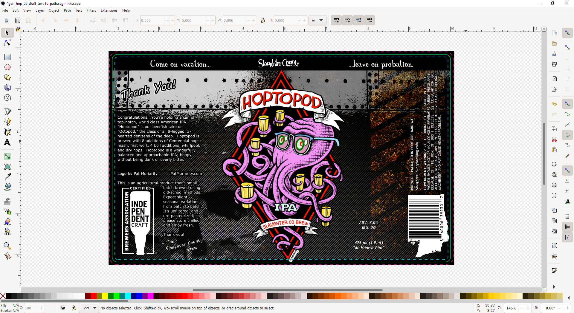
… Big candy-like buttons, no info about layers or elements, and my eye is being drawn all over the interface because the workspace and the tool/menu areas are all the same tone/color.
Here’s what I was able to come up with:
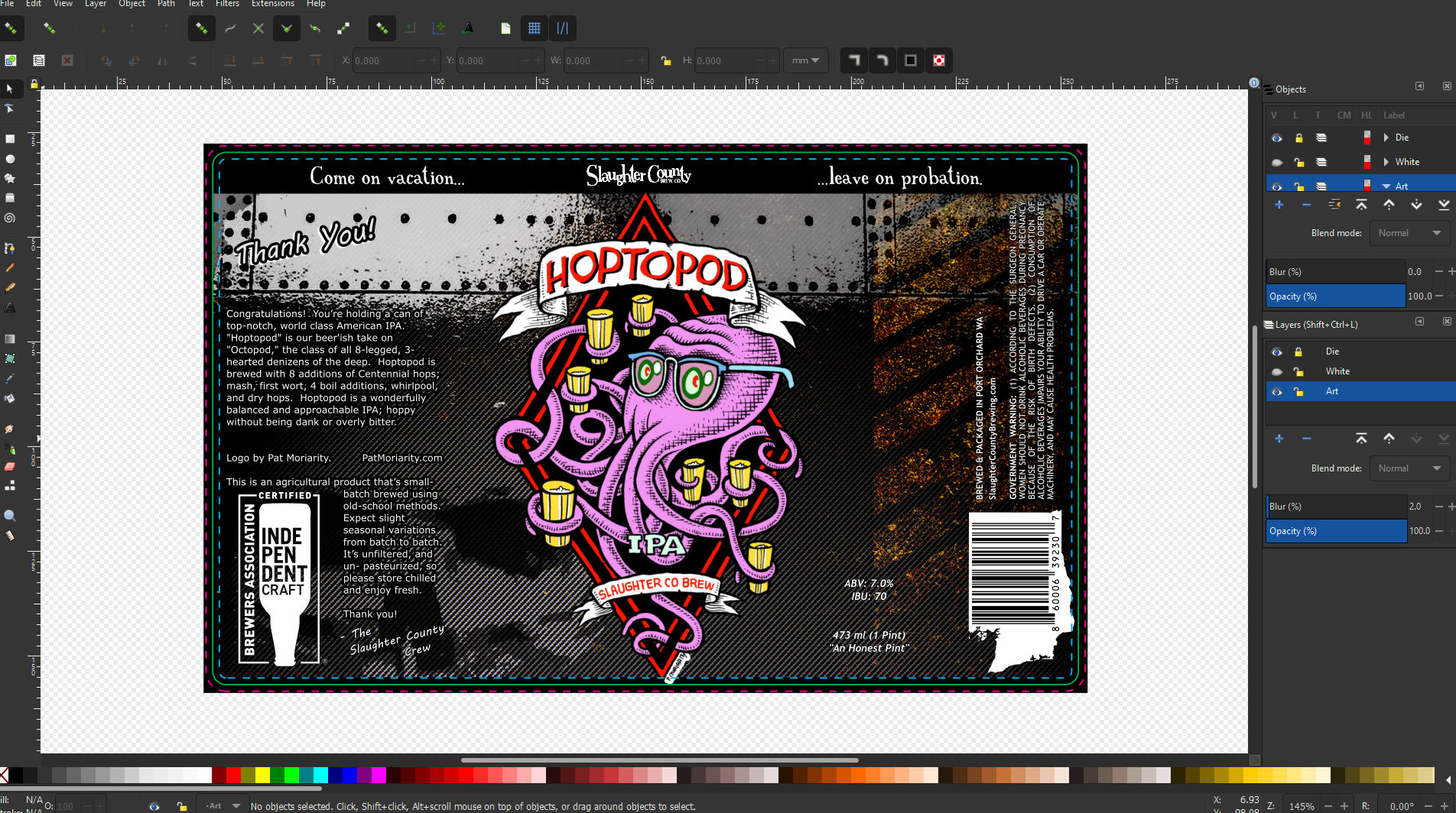
… Smaller buttons (I don’t mind the colors - monochrome illustrative
icons are an option), no buttons for things like Open..., Paste, etc,
layer/element info docked to the right, and background color changed to
delineate between the workspace and the other interface elements.
In Preferences
- (menu)
Edit -> PreferencesInterface -> Theme- check
Use dark theme Change icon theme: Tango- All icon sizes set to:
Smaller– You need to restart Inkscape to see this change
- check
In the View Menu
- (menu) `View -> Custom`
Work Full Screen
F11to work in full screen
Remove the Basic Commands Toolbar
In order to modify the toolbars themselves, you have to modify text files.
These can be found in %InstallDir%\Inkscape\share\inkscape\ui – the
files that I know which can be modified are: toolbar-commands.ui,
toolbar-tool.ui, and menu.xml.
The toolbar-commands.ui toolbar has things like, Open..., New...,
Print..., Cut, Copy, Paste, on it - These are basic commands
with hot-keys that are standard and well known anyway. Anything else is
quick enough to find in a menu and pretty infrequently used, so either
delete that or rename it so that it doesn’t get loaded at startup.
- rename
toolbar-commands.uitotoolbar-commands.ui.dead
more info: Inkscape.org: User interface customization
Layers and Object Info in the Dock
Pop-up dialogs in Inkscape are dockable to the right of the editing window - just open them up and drag them over there. The rules for what order they’re in and which ones are open seems a little wanky and out of control, so I won’t try to cover that. The ones I like to have open are found in the following menus:
Layers -> Layers...Object -> Objects...
When working with text, I’ll leave this docked, but it takes up a lot of width, so I’ll usually keep it closed.
Text -> Text and Font...
* CMYK – this is critically important if you need to work with a commercial printer. I still don’t have a good, free, solution for this but I have a good understanding of what to expect in terms of color changes and my printer is cooperative and they do a great job.
updated: 2021-03-26 - typos and some formatting